Part 4. Raise Your Roots! Hear me Tree!
Andy Poole had asked me to further to develop the Green Man imagery for the Wassail EP. Of course he had already featured strongly on the cover image - the King of the Orchard, the God of the Forest, he who should be worshiped and appeased in the hope of a fruitful apple harvest. The band felt it would be interesting to integrate the Green Man further into the visual cues representing Big Big Train's latest musical adventures. The Green Man is such an enduring image. Variations can be found in different cultures throughout the world. Always representing the cycle of growth and rebirth - it felt like a very comfortable fit for the band, as they step forward into a new chapter.
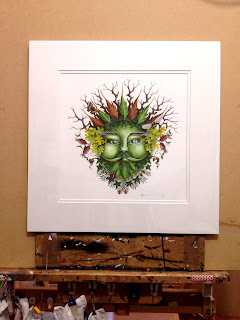
So I set about drawing up a larger, more detailed version of the GM head from the EP cover. I asked the band if I could include a few more elements of nature, woven into the image - to in some way link back to BBT's previous songs (a nice way to represent the circle of life - old to new, to old). Greg liked the idea very much - and so I chose a Tortoiseshell buttefly (song: Curator of Butterflies), a Ladybird (song: Uncle Jack) and a bee (there isn't a song for this, I just love bees!!).
Once a graphite and ink sketched had been worked up and approved by the band, I could set to work painting the final piece. Obviously certain elements would need refining for the final painting.
At the same time, the band also asked me if I would look at a revised logo for them - something a little more in-keeping with direction of their latest work. Inspiration for BBT's latest cannon had taken a step into a new chapter - away from the steel, steam and industry of English Electric and more towards the natural world, the rhythm and pathways of our folkloric fabric.
Here I chose to revisit the magpie which had featured in the Wassail crown, circling the Little Eve & Little Adam image on the EP cover. However, I needed to find a visual cue which would work well in black and white and also on merchandise. Inspiration for this came easily - as I made my morning cup of tea. My cottage looks out over rolling fields. From my kitchen window, every day I see a family of rooks sweep across the meadows, seeking food. They provide such a strong silhouette against the sky. For me they represent nature and the land. They survive in spite of everything we do to destroy our environment. They adapt and change. A little like our folklore. It adapts and changes, as we do, but is ever present. Perfect!
I wanted the actual logo itself to have quite an organic, genuine, homespun feel. So all these elements were hand drawn and inked - nothing was created using a computer of any sort. It would just have been too clinical. I wanted all the Wassail artwork to have a feeling of authenticity - it just felt right and in-keeping with what the music was trying to communicate.
So as I write this, I am taking a break from hand-embellishing the Green Man prints which have been created to celebrate Big Big Train's upcoming concerts at Kings Place in London. The merchandise has now all been released for sale, featuring my imagery. I have seen photos of the Wassail EP cover which have come in from all over the world and pictures of BBT fans proudly wearing their BBT Green Man t-shirts. And it has been the deepest joy. I feel blessed to have worked on such a wonderful project, with such a lovely group of people - and such warm and enthusiastic fans.
Tickets ready please, passengers - see you all on August 15th!
Love & Light
Sarah


No comments:
Post a Comment