Friday 31 July 2015

Sounds of Laughter, Shades of Light
It is the last day of July.  Summer seems to be slipping away very quickly this year.  If you were happy, wrapping yourself in the blissful warmth of the summer sun, only to find it swept away by driving rain and autumnal temperatures, you can probably blame me.  We had scaffolding erected at the start of the month, to carry out works on the roof and dormer window of my studio.  From that moment on, the weather has been unpredictable and disappointing.  Sorry.
Looking back, it has been a really busy month for me, with lots of getting out and about, which I love.

July has brought sunshine in other ways.  You might recall that I painted a ceramic hare for the Cirencester Hare Festival (currently on display in Framemakers Gallery, in the town).  Well I was lucky enough to attend the opening night of The Names of the Hare exhibition at the New Brewery Arts centre. The exhibition features work from some of my favourite artists ( Catherine Hyde,  Hannah Willow, Tamsin Abbot, Karen Davis, Celestine & The Hare and Gloucestershire's own fabulous Dinny Pocock).  
But I am sure the other ladies wont be offended if I were to say that the real star of the show was, of course, the amazing Jackie Morris. During the evening, Jackie treated us to a reading from her brand new book, The Wild Swans (a companion piece to East of the Sun, West of The Moon). She shared some of her new, beautiful illustrations and anecdotes upon life as a writer, illustrator and artist.  I even got the chance to leaf through some of her sketch books.  What a treat!  
The exhibition really is stunning.  I would highly recommend going along for a peak.  The atmosphere is warm and magical and the work is simply gorgeous.  I cannot sing its praises highly enough. It runs until September 19th.  So plenty of time to get there.  Cirencester is a beautiful town too (okay, I am pretty biased, I know...)  Here is a couple of photos of some delicious Tamsin Abbot pieces, which I covet badly. Badly...

*****

This month also brought an unexpected but lovely invitation from Gordon and the team at the Prema Arts Centre

Gordon got in touch and asked me if I would like to come and visit, meet his team and consider the prospect of an exhibition with them.  The centre is in the next village to me, Uley, and has an enviable nationwide reputation for staging some amazing live music events, exhibitions and workshops. Housed in an old methodist chapel (and currently under-going some incredible refurbishment), Prema really is an amazing space : workshops, studios, a breath-taking exhibition space and a fabulous cafe.  I had a great morning with Prema, they were welcoming, warm and collaborative.  So now I just have to get my thinking cap on : I know the where, I just have to work out the when and the how!

****

Much time this month has been spent hand embellishing the Green Man prints in readyness for the Big Big Train  concerts at Kings Place, London, next month.  In fact the last of these prints  will be taken down to my framers this afternoon, to be put into their mounts.  
They are a limited run of 25.  Each print is unique in some way and all have been signed by me and come with a certificate of authenticity.  Once in their mount, they look really great.  I do hope the BBT fans like them! 
Note: at the end of August, I will be running a competition on this blog to win an Artist's Proof of this print. the competition will only be available to members of this blog.  So don't forget to sign up!

****

New collections of my pieces have gone into Framemakers Galleries (throughout the South/South West) and also The Acorn Gallery (Pocklington, Yorkshire) this month, which is great.  It's so nice to refresh my displays with new work.  I have launched a number of smaller pieces, which I am hoping people will respond well to.  The new works are primarily 8x8" or 12x12" (image size).  This makes them not only easier to find space for on your wall, but they also retail at sub £500, which has got to be a good thing.

****

So I am currently working on a selection of new pieces for a brand new gallery chain in Scotland (more to be revealed on that very soon).  
I am also turning my thoughts towards Christmas (yes, a bit of a swear word when you consider it will be August tomorrow!).  However, I have to plan early and am scheduling new small gift pieces (hearts, pebbles etc) for my Etsy shop (nice stocking fillers) and also working up some Christmas Card designs.  I would really like to have everything in my Gifting line in my shop by mid October. We will see!!

****

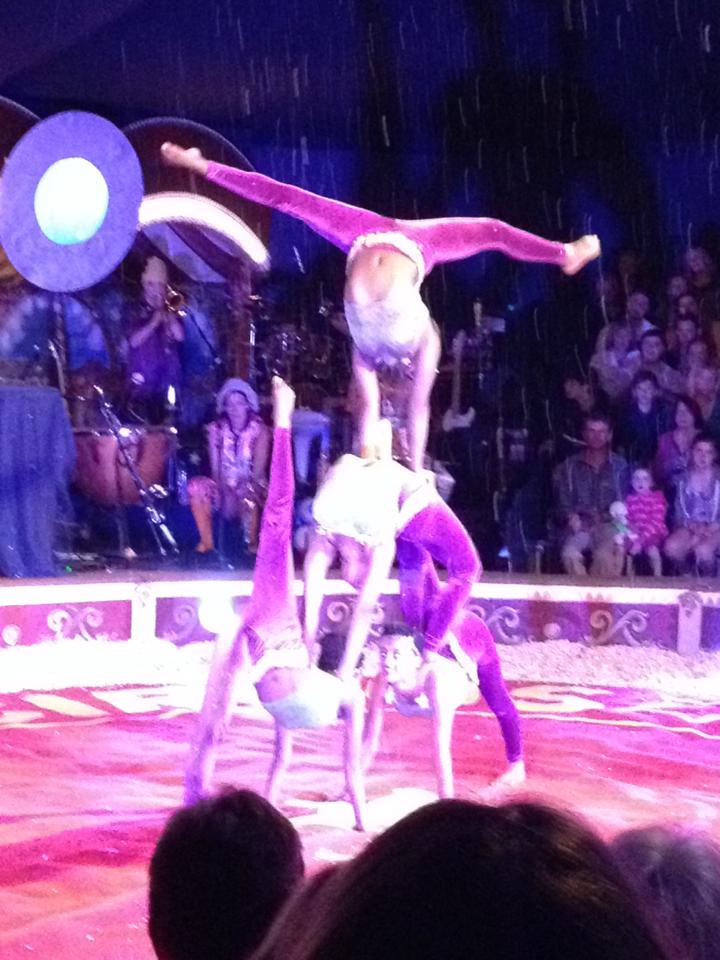
I can't let my round up of July close without mentioning the most fantastical, magical night I spent at Giffords Circus - who decamped on the village green at Frampton On Severn yesterday ( just up the road).  Giffords is a wonderful old-fashioned Victorian circus, without the animal cruelty.  As soon as you step on the the site (let alone into the big top), you are whisked away to a simpler time, a magical time, a place from somewhere deep in your memory.  Here is a quote from Nell Gifford, which says it all:

"I held the jewel of my childhood up to my eye,
and through it I saw ponies and a dressing-up box
and a tent.
And that was Giffords Circus"


****

So that's it from me for this month.  Try and enjoy the moments of sunshine, where you can (don't worry, the scaffolding comes down on Wednesday.  Summer will return then!).
Love & Light
Sarah x

Audiobooks I have enjoyed in the studio during July:
- A Boy & A Bear in A Boat - Dave Shelton
- The Behaviour of Moths - Poppy Adams


Friday 24 July 2015

Part 4.  Raise Your Roots!  Hear me Tree!

Andy Poole had asked me to further to develop the Green Man imagery for the Wassail EP.  Of course he had already featured strongly on the cover image - the King of the Orchard, the God of the Forest, he who should be worshiped and appeased in the hope of a fruitful apple harvest.  The band felt it would be interesting to integrate the Green Man further into the visual cues representing Big Big Train's latest musical adventures.  The Green Man is such an enduring image.  Variations can be found in different cultures throughout the world. Always representing  the cycle of growth and rebirth - it felt like a very comfortable fit for the band, as they step forward into a new chapter.

So I set about drawing up a larger, more detailed version of the GM head from the EP cover. I asked the band if I could include a few more elements of nature, woven into the image - to in some way link back to BBT's previous songs (a nice way to represent the circle of life - old to new, to old).  Greg liked the idea very much - and so I chose a Tortoiseshell buttefly (song: Curator of Butterflies), a Ladybird (song: Uncle Jack) and a bee (there isn't a song for this, I just love bees!!).

Once a graphite and ink sketched had been worked up and approved by the band, I could set to work painting the final piece.  Obviously certain elements would need refining for the final painting.


At the same time, the band also asked me if I would look at a revised logo for them - something a little more in-keeping with direction of their latest work.  Inspiration for BBT's  latest cannon had taken a step into a new chapter - away from the steel, steam and industry of English Electric and more towards the natural world, the rhythm and pathways of our folkloric fabric.  

Here I chose to revisit the magpie which had featured in the Wassail crown, circling the Little Eve & Little Adam image on the EP cover.  However, I needed to find a visual cue which would work well in black and white and also on merchandise.  Inspiration for this came easily - as I made my morning cup of tea.  My cottage looks out over rolling fields.  From my kitchen window, every day I see a family of rooks sweep across the meadows, seeking food. They provide such a strong silhouette against the sky.  For me they represent nature and the land.  They survive in spite of everything we do to destroy our environment.  They adapt and change. A little like our folklore.  It adapts and changes, as we do, but is ever present. Perfect!  

I wanted the actual logo itself to have quite an organic, genuine, homespun feel.  So all these elements were hand drawn and inked - nothing was created using a computer of any sort.  It would just have been too clinical.  I wanted all the Wassail artwork to have a feeling of authenticity - it just felt right and in-keeping with what the music was trying to communicate.  
 
So as I write this, I am taking a break from hand-embellishing the Green Man prints which have been created to celebrate Big Big Train's upcoming concerts at Kings Place in London. The merchandise has now all been released for sale, featuring my imagery.  I have seen photos of the Wassail EP cover which have come in from all over the world and pictures of BBT fans proudly wearing their BBT Green Man t-shirts.  And it has been the deepest joy.  I feel blessed to have worked on such a wonderful project, with such a lovely group of people - and such warm and enthusiastic fans.
Tickets ready please, passengers - see you all on August 15th!
Love & Light
Sarah


Sunday 12 July 2015

Part 3. Bough & Leaf Bear Fruit A Plenty

So David and Greg returned some feedback to me concerning the initial concept painting for the Wassail cover.  Overall they were very happy with the idea, but wanted a few tweaks and changes made. Having lived with the image for a few days, I also had a few of my own.

David was very keen to see a little more (painterly) tension between the two figures and also to match them closer in height and age.  In terms of composition this was certainly a good decision.  So I made little Eve slightly older and little Adam slightly younger.  I turned them to face each other and also made it much more obvious that she was offering him the apple.  Would he be tempted?  We also decided to make the snake more obvious, peering down over little Eve's head - illustrating that he was having an influence over her actions.  Once these tweaks and changes had been discussed and agreed, the lads gave me the go ahead to start painting proper.


I decided to use a traditional piece of stretched water colour paper for this painting.  This is because the ground takes the paint in a certain manner.  It can give a natural luminosity, if handled carefully, which I thought would be appropriate for this painting. I sketched out the piece in pencil first.


For this piece I used Golden acrylic paints (fluid),  Winsor & Newton inks and FW acrylic inks.  I absolutely love using ink.  It gives a glow like nothing else.  It is horribly unforgiving, of course.  One mistake and you've had it.  Overall I chose a cool colour palette - the piece is set in winter after all.  But I knew that the rosy glow of the apples would warm the piece up.  So I then began painting.


This piece was such a joy to paint (as have all the BBT pieces been).  It allowed me to move away from my usual strong, graphic style and indulge the detailed part of myself.  Parts of it felt a little like completing a botanical/wildlife illustration, which was just lovely to work on.  I think the Magpie was my favourite little addition - and he also sparked an idea which was to come in very handy a little further down the line.


The final piece went off to Andy Poole at the end of January (if memory serves) and I was really delighted when the band members messaged me back to say that they all loved it.


At this point I felt really quite sad.  For me, the Wassail project was over.  It had been so lovely to work on, allowed me to explore and indulge a different part of my painting set. It had also been a great experience working with Greg, David and Andy - nicer fellas you could not wish to meet.  So with some sadness, I took a step back and closed the chapter on Wassail.  Until about 2 weeks later when Andy got back in touch and said "Um, you know your Green Man?  Well, we've all been chatting and we were thinking we'd like to explore him a little further.  How does that sound?"  It sounds great Andy!  So out came my paint brushes again!